How each team’s probability of reaching a particular stage has evolved over time
python
altair
visualisation
football
Published
December 19, 2022
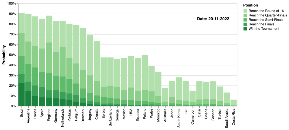
As the 2022 FIFA World Cup comes to an end, it is interesting to look at quantitative data to see how each team’s probability of reaching a particular stage has evolved over time. As explained in my previous post, it is possible to back out the implied probability for each outcome from the odds quoted from the betting markets. The full dataset of probabilities for the 2022 world cup can be found here.
Probability of final position per team over time (animated)
Source: own computation, betting markets; dataset available here
In the chart above the somewhat unexpected semi-final entries of Marocco and Croatia stand out in particular.
Another way to visualise the dataset is to look at the probability of each team winning the overall tournament. The chart below shows that probability as a line chart:
Probability of winning the tournament per team over time (interactive)